


Main Logotype

Discover our logo — a bold, timeless emblem crafted to capture innovation and authenticity. Every line and color is designed for instant recognition, embodying our commitment to quality and creative excellence.
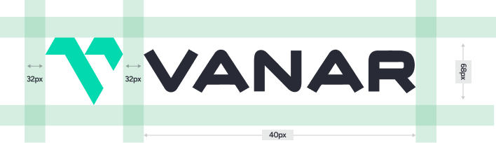
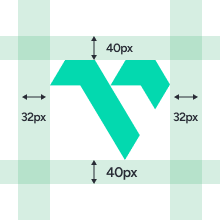
A considerable space is required in around the logo to hinder any clutter caused by surrounding images and/or artwork or by the edge of the page. Shown below are the spacing required for both the logo and wordmark.

Do not distort, skew, or alter the logo’s proportions. Don’t add extra design elements or effects that compromise its integrity.

Don’t reduce the opacity of the logo

Don’t add outlines to the logo

Don’t add shadows behind the logo

Don’t stretch the logo
Our palette is carefully chosen to reflect our bold and creative identity. Each hue embodies our values and creates a vibrant, memorable impression.
Access our curated collection of logos, typography, color palettes, and other key design elements. Use these assets to maintain a consistent and impactful brand identity.


